(ORG-2523)![]()
Sample OPJ to download to try: Box Plot.opj
| Table of Contents | ||||
|---|---|---|---|---|
|
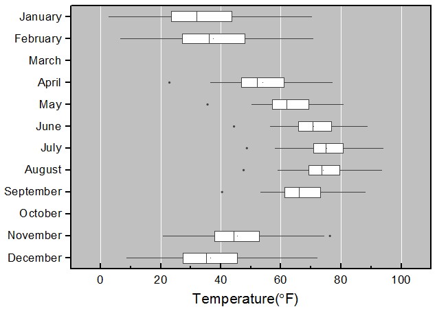
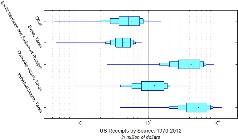
Grouped Box Chart
...
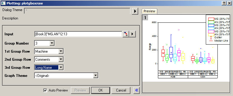
Origin supports plotting grouped Box chart from both Indexed Data or Raw Data. Menus are available under Plot: Statistics menu. Buttons are available from 2D Graphs toolbar.
| |
 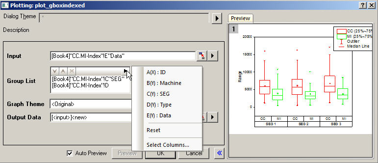 |   |
How to:
Note:
| |

...
|
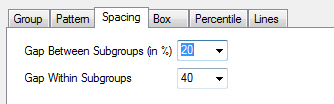
Grouped-Plot-Only Style Controls
|
|
How to:
| |
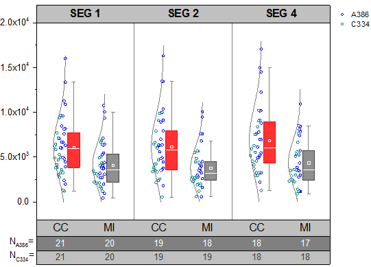
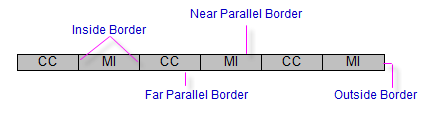
Box Position with Information from Column Label Rows
(ORG-1943, ORG-40944094) (ORG-8275)
   |  |
How to:
| |
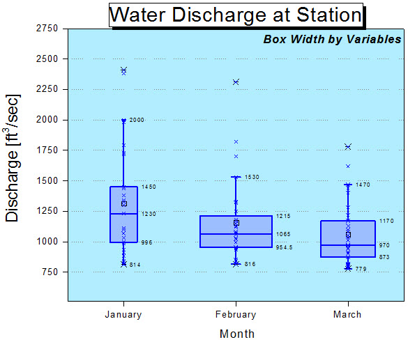
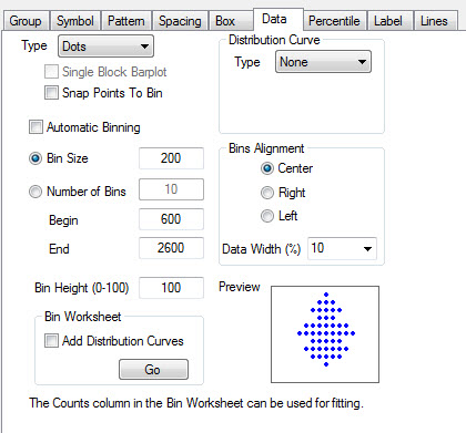
More Control of Data
...
and
...
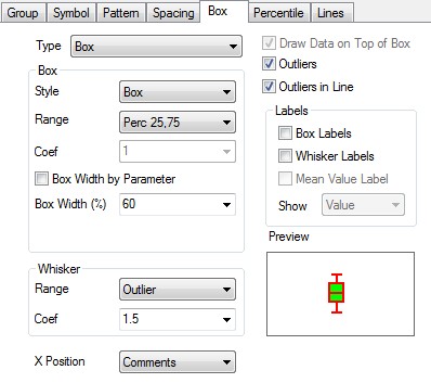
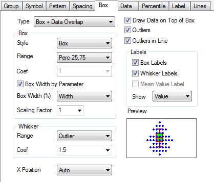
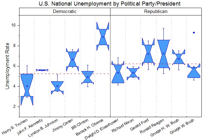
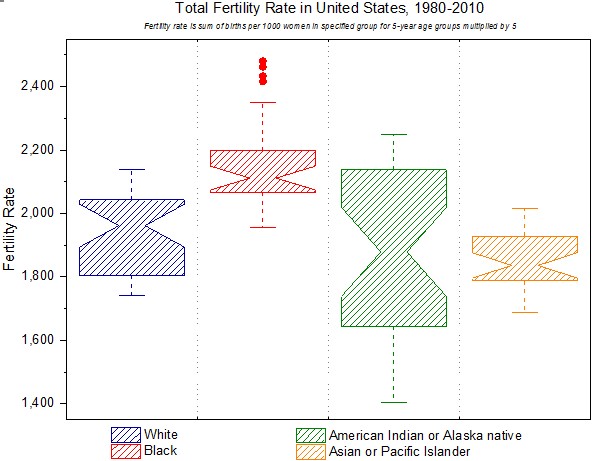
Box
(ORG-1943, ORG-981, ORG-5901, ORG-5881, ORG-1905)
 |   | |||||
  | 
| |||||
| How to: | Index
| check
| checkbox and set Scaling Factor.
| data
| dragdown
|

...
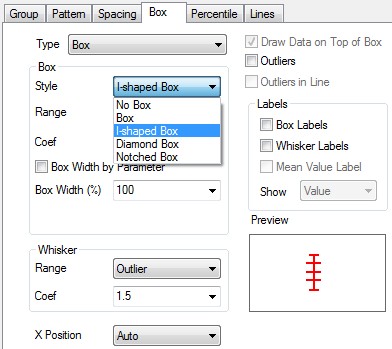
More Box Style
(ORG-7839 , ORG-9426 , ORG-8656)
...
 |  |
 |  |
 |  |
| How to: Go to Plot Details: Plot Properties: Box tab, set Box: Style to be I-shaped/Notched Box. You can also change the parameters to custom your own box style. |
Individual Controls for Whiskers Caps Median Mean and Distribution curve
(ORG-816)
 | 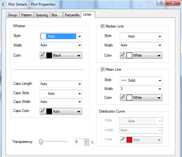 |
How to: Go to Plot Details: Plot Properties: Lines tab. | |
Outliers in Line
(ORG-4305)


 | 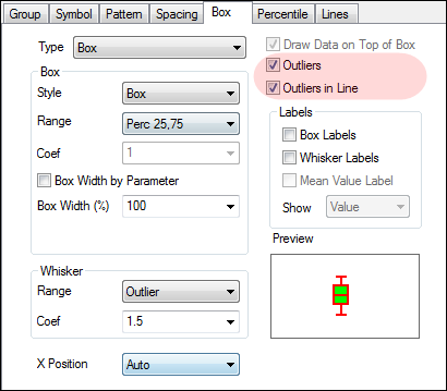 |
How to:
| |
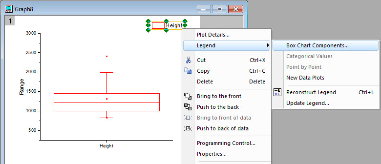
Box Chart Legend
(ORG-4346 , ORG-8960)
 | |
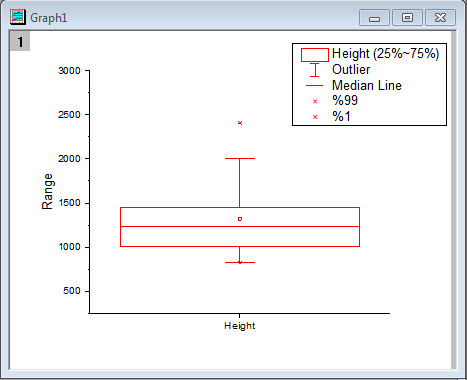 | 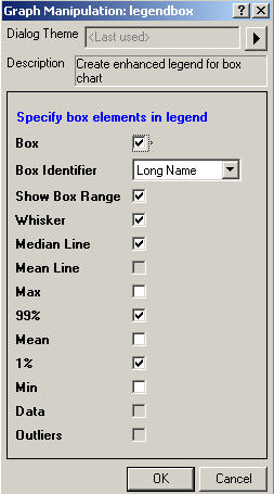 |
How to:
| |
...
|
...
|
...

...
|
Built-in Box Chart Themes
(ORG-7916)
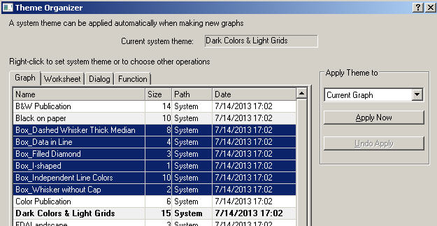 |
How to: With Box chart graph window active, open Tools:Theme Organizer. We provide some common box chart themes. User can apply it to quickly change box chart. |
...

...
How to
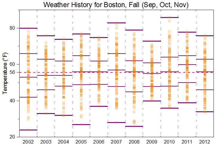
The Sample OPJ includes 6 sample graphs (4 in "1. Grouped Box Plot and Axis Ticks Table" folder, and 1 for both
"2. Box Plot Position By Variables" and "3. Box Width By Variable" folders) to show the remarkable improvements
in box chart
Grouped Box Plot with Color-indexed Data Points
...
How to make the basic form of the grouped box plot
...
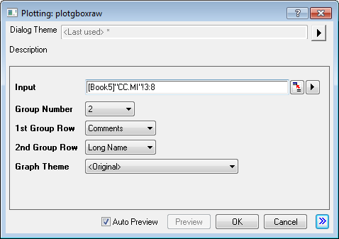
- Active the workbook in the Book5 in "1. Grouped Box Plot and Axis Ticks Table" folder, highlight column E through column J,
select "Plot: Statistics: Grouped Box Charts - Raw Data" from Origin menu - In the opened dialog, apply the settings as image below and click OK button to create a graph

Before we set the axes of the box chart, we prepare the number of data points of each column in "CC.MI" sheet by steps as below
- Highlight the rows for A386 of "CC.MI" sheet
- Type script below in the Script Window and press Enter. (If Script Window is not opened yet, open it from menu, Window: Script Window)
colstats; - Set the sheet name as A386_CC.MI
- Do the same to have C334_CC.MI sheet
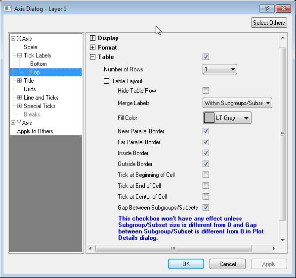
How to Customize the Table-liked Tick Labels
| 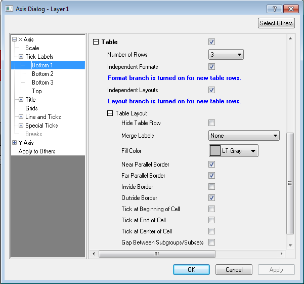 |
How to:
| |
|  |
How to:
| |
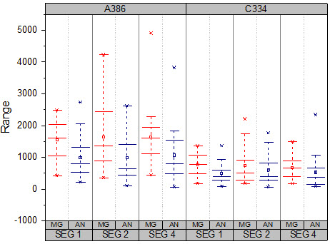
How to customize to make Graph1
| How to: Graph1 illustrate 3 improvements of the Box Chart in 9.1 |
How to customize to make Graph2
| How to: Graph2 illustrate 3 improvements of the Box Chart in 9.1 |
How to customize to make Graph3
| How to: Graph3 illustrate 4 improvements of the Box Chart in 9.1 |
How to customize to make Graph4
| How to: Graph4 illustrate 3 improvements of the Box Chart in 9.1 |
How to customize to make Graph5
| How to: Graph5 illustrate 2 improvements of the Box Chart in 9.1 |
How to customize to make Graph6
| How to: Graph6 illustrate 3 improvements of the Box Chart in 9.1 |