(ORG-2523)![]()
Sample OPJ to download to try: Box Plot.opj
| Table of Contents | ||||
|---|---|---|---|---|
|
...
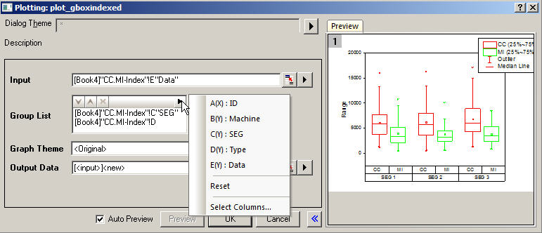
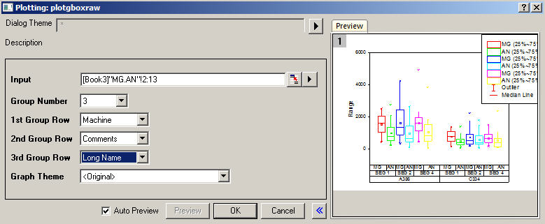
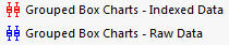
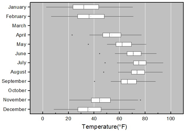
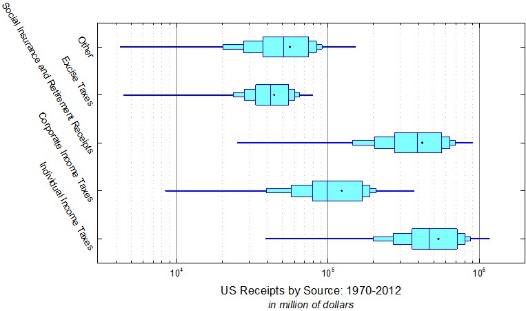
Origin supports plotting grouped Box chart from both Indexed Data or Raw Data. Menus are available under Plot: Statistics menu. Buttons are available from 2D Graphs toolbar.
| |
  |   |
How to:
Note:
| |

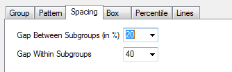
Grouped-Plot-Only Style Controls
|
|
How to:
| |
...
|
Box Position with Information from Column Label Rows
(ORG-1943, ORG-40944094) (ORG-8275)
   |  |
How to:
| |
More Control of Data and Box
(ORG-1943, ORG-981, ORG-5901, ORG-5881, ORG-1905)
 |   | |||||
  | 
| |||||
| How to: | Index
| check
| checkbox and set Scaling Factor.
| data
| dragdown
|

...
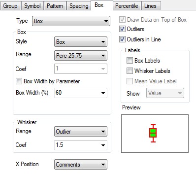
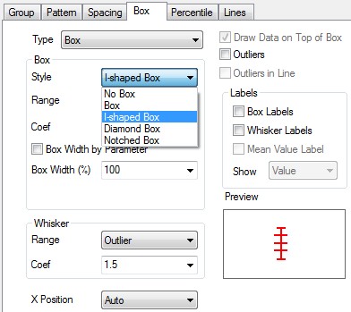
More Box Style
(ORG-7839 , ORG-9426 , ORG-8656)
...
 |  |
 |  |
 |  |
| How to: Go to Plot Details: Plot Properties: Box tab, set Box: Style to be I-shaped/Notched Box. You can also change the parameters to custom your own box style. |
Individual Controls for Whiskers Caps Median Mean and Distribution curve
(ORG-816)
 | 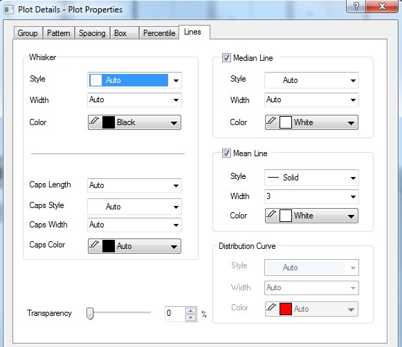 |
How to: Go to Plot Details: Plot Properties: Lines tab. | |
Outliers in Line
(ORG-4305)


 | 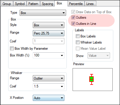 |
How to:
| |
Box Chart Legend
(ORG-4346 , ORG-8960)
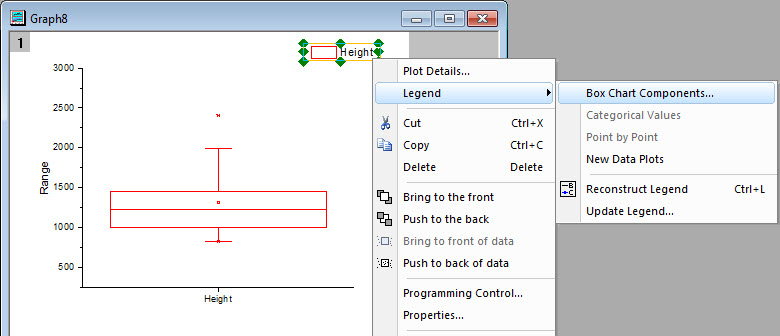 | |
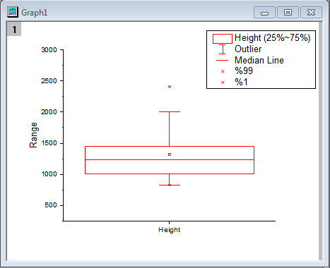 | 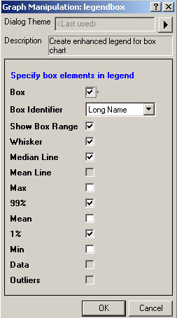 |
How to:
| |
...
|
...
|
...

...
|
Built-in Box Chart Themes
(ORG-7916)
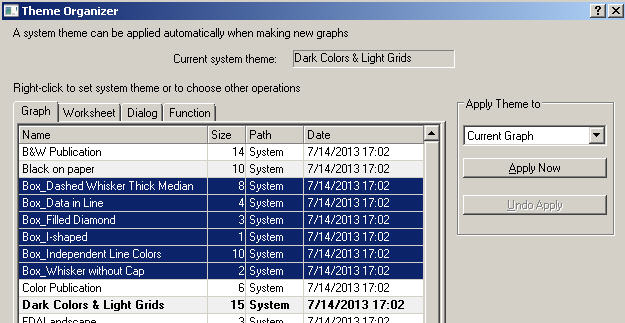 |
How to: With Box chart graph window active, open Tools:Theme Organizer. We provide some common box chart themes. User can apply it to quickly change box chart. |
...

...
How to
The Sample OPJ includes 6 sample graphs (4 in "1. Grouped Box Plot and Axis Ticks Table" folder, and 1 for both
"2. Box Plot Position By Variables" and "3. Box Width By Variable" folders) to show the remarkable improvements
in box chart
Grouped Box Plot with Color-indexed Data Points
...
How to
...
make the basic form of the grouped box plot
...
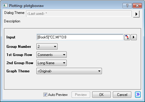
2> In the opened dialog, apply the settings as below and click OK button to create a graph
* Group Number = 2
* 1st Group Row = Comments
* 2nd Group Row = Long Name
* Graph Theme = <Original>
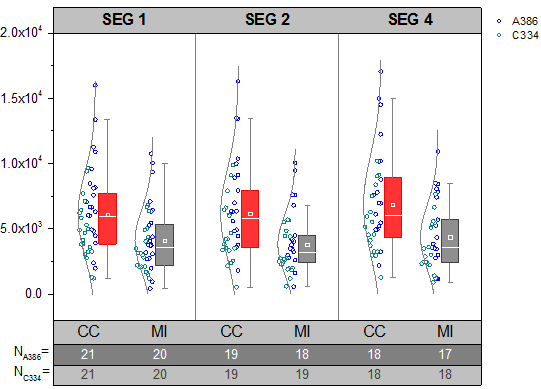
Before we set the axes of the box chart, we prepare the number of data points of each column in "CC.MI" sheet by steps as below
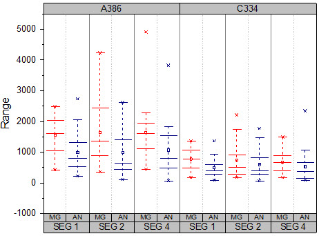
1>. Highlight the "A386" rows [1:21] of col(E)~col(J) in sheet "CC.MI"
2>. Type script below in the Script Window and press Enter. (If Script Window is not opened yet, open it from menu, Window: Script Window)
colstats -r 2 sd:=<optional> q1:=<new> q3:=<new>;
3>. Set the sheet name as A386_CC.MI
4> Highlight the "c334" rows [22:42] of col(E)~col(J) in sheet "CC.MI", do the same to have C334_CC.MI sheet
Then, we are going to customize the box plots
1> Double click on the plot to open the Plot Details dialog
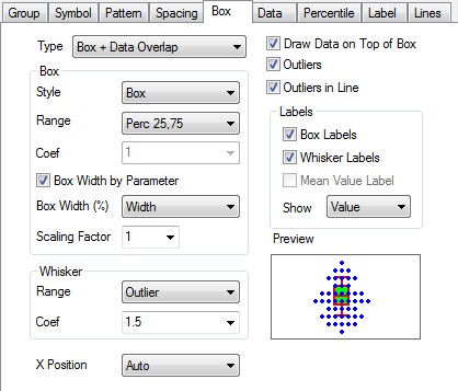
2> Select Box tab, apply these settings
* Type = Box[Right] + Data[Left]
3> Select Symbol tab, apply these settings
* Size = 5
* Symbol Color = Indexing: Col (B)
* Shape = 2 Circle
* Interior = Open
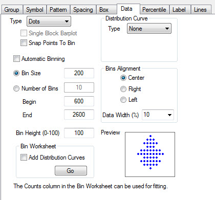
4> Select Data tab, apply these settings
* Distribution Curve group, Type = Normal
* Bins Alignment group = Right
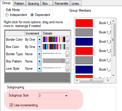
5> Select Group tab, apply settings as below
* Box Color>Increment = By One
* Box Color>Details = (1: Red, 2: Navy)
* Border Color>Details = (1: Red, 2: Navy)
6>Select Lines tab, apply settings as below
* Whisker group, Color = Gray
* Caps Color = Gray
* Median Line group, Color = White
* Distribution Curve group, Color = Gray
7>Select Percentile tab, apply settings as below
* Edge Color = White
Then, we are going to customize the axis and tick labels
1>. Double click on the bottom axis to open the Axis dialog.
2>. Go to the X Axis>Tick Labels node
* Select Show Major Labels on Top Axis
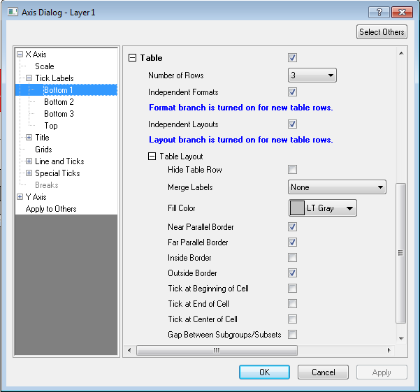
3> Choose Bottom1 in the left panel, In the Bottom1 page,
* Table branch
*> Number of Rows = 3
* >Uncheck Merge Labels
* >Select Independent Formats
* >Table Layout branch
*>>Fill Color = LT Gray
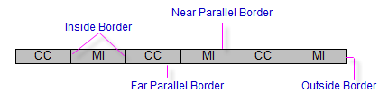
* >>Check Near Parallel Border
* >>Uncheck Perpendicular Border
* >>Select Independent Layouts
* Display branch
* >Type = Text from dataset
* >Dataset Name = [Book5]"C334_CC.MI"!C"N"
* Format branch
* >Color = Dark Gary
4>Choose Bottom2 in the left panel. in the Bottom2 page
* Display branch
* >Type = Text from dataset
* >Dataset Name = [Book5]"A386_CC.MI"!C"N"
* Table Layout branch
* > Fill Color = Gray
* >Uncheck Near Parallel Border
* >Uncheck Perpendicular Border
* Format branch
* >Color = White
5>Choose Bottom3 in the left panel. in the Bottom3 page
* Display branch
* >Type = Column Name or Label
* >Display = Column headings
* Table Layout branch
* >Uncheck Perpendicular Border
* Format branch
* >Size = 22
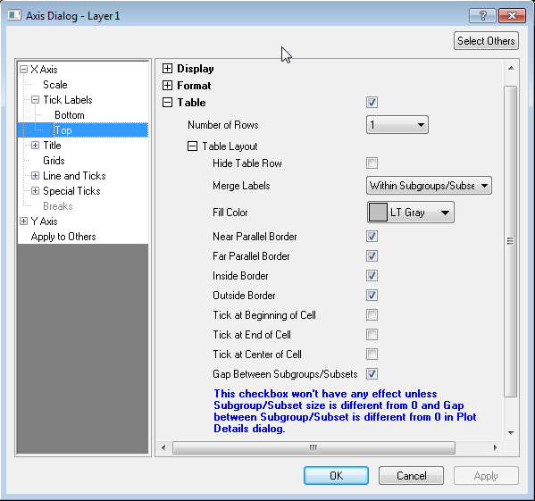
6>Choose Top in the left panel. in the Top page
* Display branch
* >Type = Column Name or Label
* >Display = Comments
* Format branch
* >Size = 22
* >Select Bold
* Select Table check box
* >Uncheck Perpendicular Border
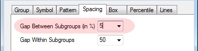
* >Uncheck Gap Between Subgroups/Subsets
* > Fill Color = LT Gray
7> Choose Grids in the left panel
* Major Grid Lines branch
* >Select Show
* >Color = Gray
8> Click OK to apply the settings
9> Double on the tick labels of the Y Axis to open the Axis dialog
10> Select Y Axis>Scale in the left panel
* From = -2000
* To = 20000
* Major Ticks branch
* >Value = 5000
11> Select Y Axis>Tick Labels>Left in the left panel
* Display branch
* >Display = Scientific: 10^3
12> Click OK to apply the settings and close dialog
Now we are going to add a legend to explain thescatter points
1> Delete the legend
2> Select Graph: Add/Update Lgend Entries: Categorical Values from the Origin menu to add new legend to the graph.
3> Double click on the legend to be in edit mode, update the text as below
%(1,m1,1)
%(1,m2,1)
To customized the box plot
-------------------------------------------------------------------------
To set subgroup size:
1). Go to "Plot Details" dialog, Plot Properties level, "Group" tab, You will find a new control group called "Subgrouping".
2). You can choose the subgroup size in the drag-down list. Origin9.1 support subgroup size up to 14 boxes.
3). Checking the "Use Increment" checkbox to repeat the increment list in each subgroup.
-------------------------------------------------------------------------
To set tick label tables:
1). Open Axis Dialog, go to "Tick Labels" page under the axis you want to put tables on.
2). Check "Table" checkbox, and detailed setting interfaces will show in the dialog.
-------------------------------------------------------------------------
To index data point color:
1). Go to "Plot Details" dialog, Plot Properties level, "Box" tab, and set "Type" to show the data points. (In Graph1, type is set to "Box[Right]+Data[Left]")
2). Go to "Symbol" tab, set your symbol type and choose the index column in color drag-down list. (In Graph1, symbol is open circle and edge color is indexed by col(B))
-------------------------------------------------------------------------
To custom Whisker, Cap, Median, Mean or Distribution Curve:
1). Go to "Plot Details" dialog, Plot Properties level, "Lines" tab.
2). Each line details can be customized. (In Graph2&4, whisker color is set to Gray and Cap length is 0, mean/madian line s are also customlized)
-------------------------------------------------------------------------
To set I-Shape Box and Outliers aligned in a line:
1). Go to "Plot Details" dialog, Plot Properties level, "Box" tab, and set "Style" to "I-Shape box".
2). Check "Outliers" checkbox and "Outliers in a line" checkbox to show outliers. (Graph3)
-------------------------------------------------------------------------
...
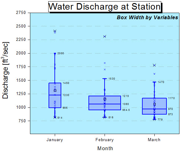
- Active the workbook in the Book5 in "1. Grouped Box Plot and Axis Ticks Table" folder, highlight column E through column J,
select "Plot: Statistics: Grouped Box Charts - Raw Data" from Origin menu - In the opened dialog, apply the settings as image below and click OK button to create a graph

Before we set the axes of the box chart, we prepare the number of data points of each column in "CC.MI" sheet by steps as below
- Highlight the rows for A386 of "CC.MI" sheet
- Type script below in the Script Window and press Enter. (If Script Window is not opened yet, open it from menu, Window: Script Window)
colstats; - Set the sheet name as A386_CC.MI
- Do the same to have C334_CC.MI sheet
...
Graph1 illustrate 3 improvements of the Box Chart in 9.1
...
How to Customize the Table-liked Tick Labels
|  |
How to:
| |
|  |
How to:
| |
How to customize to make Graph1
| How to: Graph1 illustrate 3 improvements of the Box Chart in 9.1 |
How to customize to make Graph2
| How to: Graph2 illustrate 3 improvements of the Box Chart in 9.1 |
How to customize to make Graph3
| How to: Graph3 illustrate 4 improvements of the Box Chart in 9.1 |
How to customize to make Graph4
| How to: Graph4 illustrate 3 improvements of the Box Chart in 9.1 |
How to customize to make Graph5
| How to: Graph5 illustrate 2 improvements of the Box Chart in 9.1 |
How to customize to make Graph6
| How to: Graph6 illustrate 3 improvements of the Box Chart in 9.1 |