(ORG-2523)![]()
Sample OPJ to download to try: Box Plot.opj
| Table of Contents | ||||
|---|---|---|---|---|
|
...
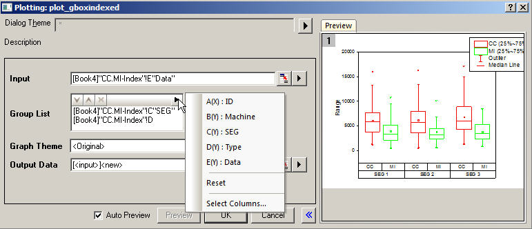
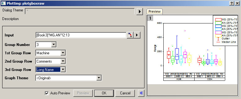
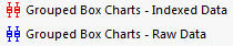
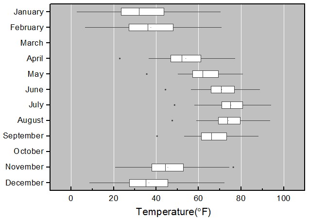
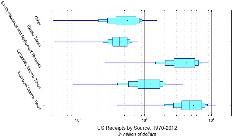
Origin supports plotting grouped Box chart from both Indexed Data or Raw Data. Menus are available under Plot: Statistics menu. Buttons are available from 2D Graphs toolbar.
| |
  |   |
How to:
Note:
| |

Grouped-Plot-Only Style Controls
|
|
How to:
| |
...
|
Box Position with Information from Column Label Rows
(ORG-1943, ORG-40944094) (ORG-8275)
   |  |
How to:
| |
More Control of Data and Box
(ORG-1943, ORG-981, ORG-5901, ORG-5881, ORG-1905)
  |  | |||||
  | 
| |||||
| How to: | Index
| check
| checkbox and set Scaling Factor.
| data
| dragdown
|

...
More Box Style
(ORG-7839 , ORG-9426 , ORG-8656)
...
 |  |
 |  |
 |  |
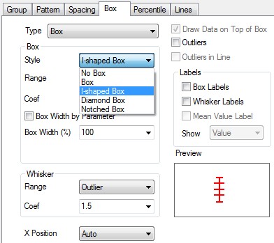
| How to: Go to Plot Details: Plot Properties: Box tab, set Box: Style to be I-shaped/Notched Box. You can also change the parameters to custom your own box style. |
Individual Controls for Whiskers Caps Median Mean and Distribution curve
(ORG-816)


 | 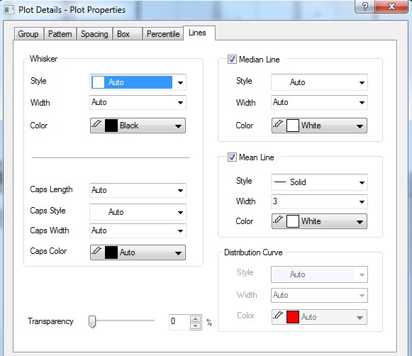 |
How to: Go to Plot Details: Plot Properties: Lines tab. | |
Outliers in Line
(ORG-4305)
 | 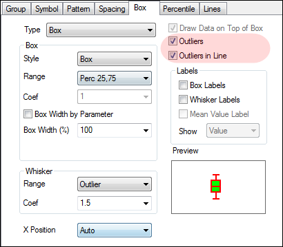 |
How to:
| |
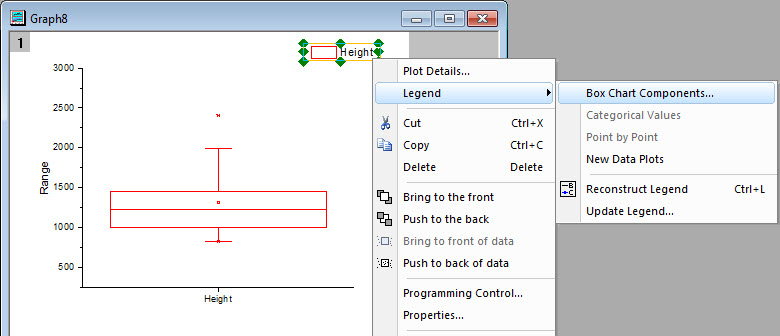
Box Chart Legend
(ORG-4346 , ORG-8960)
 | |
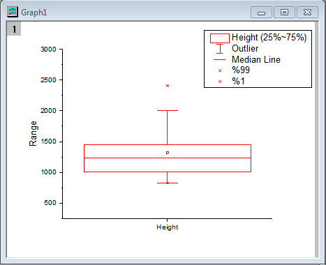 | 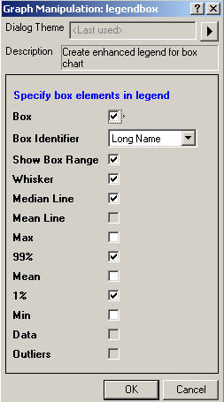 |
How to:
| |
...
|
...
|
...


|
Built-in Box Chart Themes
(ORG-7916)
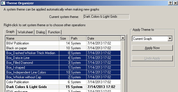 |
How to: With Box chart graph window active, open Tools:Theme Organizer. We provide some common box chart themes. User can apply it to quickly change box chart. |
...

...
How to
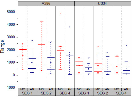
The Sample OPJ includes 6 sample graphs (4 in "1. Grouped Box Plot and Axis Ticks Table" folder, and 1 for both
"2. Box Plot Position By Variables" and "3. Box Width By Variable" folders) to show the remarkable improvements
in box chart
...
How to
...
make the basic form of the grouped box plot
...
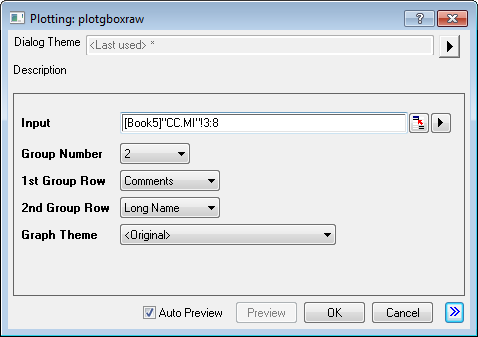
2> In the opened dialog, apply the settings as below and click OK button to create a graph
* Group Number = 2
* 1st Group Row = Comments
* 2nd Group Row = Long Name
* Graph Theme = <Original>
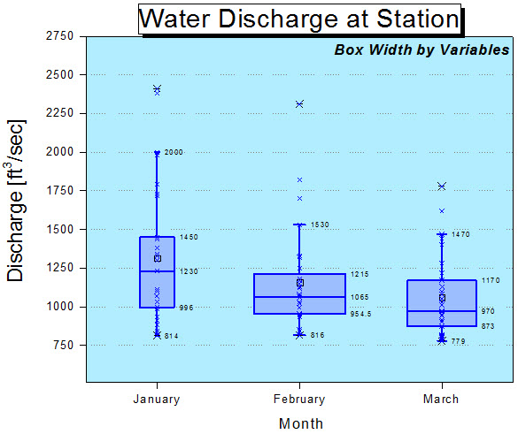
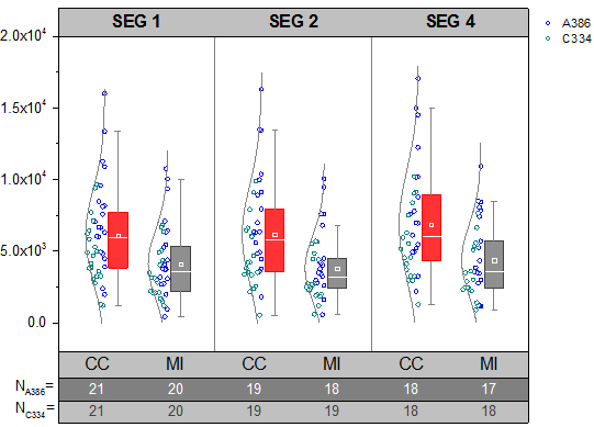
Before we set the axes of the box chart, we prepare the number of data points of each column in "CC.MI" sheet by steps as below
1>. Highlight the "A386" rows [1:21] of col(E)~col(J) in sheet "CC.MI"
2>. Type script below in the Script Window and press Enter. (If Script Window is not opened yet, open it from menu, Window: Script Window)
colstats -r 2 sd:=<optional> q1:=<new> q3:=<new>;
3>. Set the sheet name as A386_CC.MI
4> Highlight the "c334" rows [22:42] of col(E)~col(J) in sheet "CC.MI", do the same to have C334_CC.MI sheet
Then, we are going to customize the box plots
1> Double click on the plot to open the Plot Details dialog
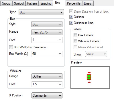
2> Select Box tab, apply these settings
* Type = Box[Right] + Data[Left]
3> Select Symbol tab, apply these settings
* Size = 5
* Symbol Color = Indexing: Col (B)
* Shape = 2 Circle
* Interior = Open
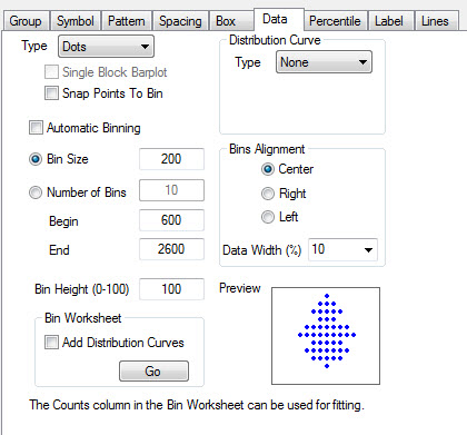
4> Select Data tab, apply these settings
* Distribution Curve group, Type = Normal
* Bins Alignment group = Right
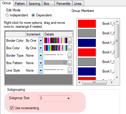
5> Select Group tab, apply settings as below
* Box Color>Increment = By One
* Box Color>Details = (1: Red, 2: Navy)
* Border Color>Details = (1: Red, 2: Navy)
6>Select Lines tab, apply settings as below
* Whisker group, Color = Gray
* Caps Color = Gray
* Median Line group, Color = White
* Distribution Curve group, Color = Gray
7>Select Percentile tab, apply settings as below
* Edge Color = White
Then, we are going to customize the axis and tick labels
1>. Double click on the bottom axis to open the Axis dialog.
2>. Go to the X Axis>Tick Labels node
* Select Show Major Labels on Top Axis
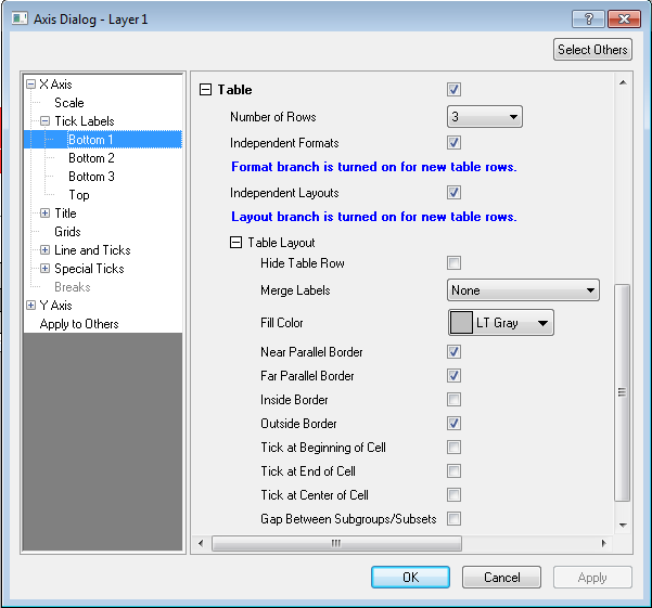
3> Choose Bottom1 in the left panel, In the Bottom1 page,
* Table branch
*> Number of Rows = 3
* >Uncheck Merge Labels, * >Select Independent Formats,
* >Table Layout branch
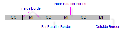
*>>Fill Color = LT Gray, * >>Check Near Parallel Border, * >>Uncheck Perpendicular Border
* >>Select Independent Layouts
* Display branch
* >Type = Text from dataset, * >Dataset Name = [Book5]"C334_CC.MI"!C"N"
* Format branch
* >Color = Dark Gary
4>Choose Bottom2 in the left panel. in the Bottom2 page
* Display branch
* >Type = Text from dataset, * >Dataset Name = [Book5]"A386_CC.MI"!C"N"
* Table Layout branch
* > Fill Color = Gray, * >Uncheck Near Parallel Border, * >Uncheck Perpendicular Border
* Format branch
* >Color = White
5>Choose Bottom3 in the left panel. in the Bottom3 page
* Display branch
* >Type = Column Name or Label, * >Display = Column headings
* Table Layout branch
* >Uncheck Perpendicular Border
* Format branch
* >Size = 22
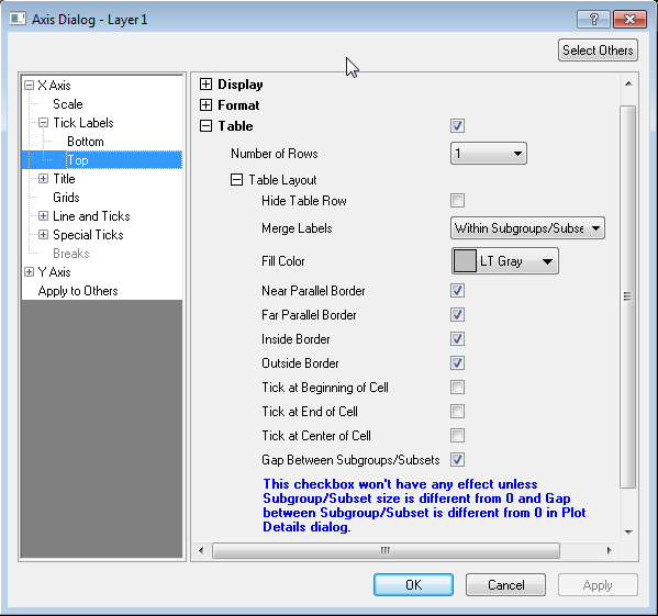
6>Choose Top in the left panel. in the Top page
* Display branch
* >Type = Column Name or Label, * >Display = Comments
* Format branch
* >Size = 22, * >Select Bold
* Select Table check box
* >Uncheck Perpendicular Border, * >Uncheck Gap Between Subgroups/Subsets, * > Fill Color = LT Gray
7> Choose Grids in the left panel
* Major Grid Lines branch
* >Select Show, * >Color = Gray
8> Click OK to apply the settings
9> Double on the tick labels of the Y Axis to open the Axis dialog
10> Select Y Axis>Scale in the left panel
* From = -2000
* To = 20000
* Major Ticks branch
* >Value = 5000
11> Select Y Axis>Tick Labels>Left in the left panel
* Display branch
* >Display = Scientific: 10^3
12> Click OK to apply the settings and close dialog
Now, we are going to add a legend to explain thescatter points
1> Delete the legend
2> Select Graph: Add/Update Lgend Entries: Categorical Values from the Origin menu to add new legend to the graph.
3> Double click on the legend to be in edit mode, update the text as below
%(1,m1,1)
%(1,m2,1)
How to customize to make Graph2
...
- Active the workbook in the Book5 in "1. Grouped Box Plot and Axis Ticks Table" folder, highlight column E through column J,
select "Plot: Statistics: Grouped Box Charts - Raw Data" from Origin menu - In the opened dialog, apply the settings as image below and click OK button to create a graph

Before we set the axes of the box chart, we prepare the number of data points of each column in "CC.MI" sheet by steps as below
...
How to customize to make Graph1
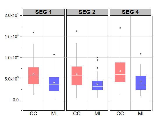
Graph1 illustrate 3 improvements of the Box Chart in 9.1
...
How to Customize the Table-liked Tick Labels
|  |
How to:
| |
|  |
How to:
| |
How to customize to make Graph1
| How to: Graph1 illustrate 3 improvements of the Box Chart in 9.1 |
How to customize to make Graph2
| How to: Graph2 illustrate 3 improvements of the Box Chart in 9.1 |
...
...
1> Active Book5 in the project. Go to sheet "CC.MI", highlight column E through column J, select "Plot: Statistics: Grouped Box Charts - Raw Data" from Origin menu
2> In the opened dialog, apply the settings as below and click OK button to create a graph
* Group Number = 2
* 1st Group Row = Comments
* 2nd Group Row = Long Name
* Graph Theme = <Original>
Then, we are going to customize the box plots
1> Double click on the plot to open the Plot Details dialog
2> Select Group tab, apply settings as below
* Border Color>Details = (1: Red, 2: Navy)
* Box Color>Increment = By One
* Box Color>Details = (1: Red, 2: Navy)
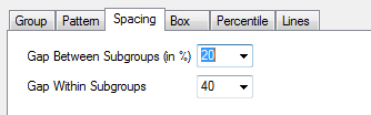
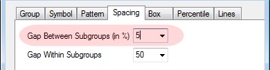
3> Select Spacing tab, apply settings as below
* Gap Between Subgroups (in %) = 5
* Gap Within Subgroups = 50
4>Select Percentile tab, apply settings as below
* Edge Color = White
5>Select Lines tab, apply settings as below
* Whisker group, Color = Gray
* Caps Length = 0
* Median Line group, Color = White
Then we are going to customize the axis and tick labels
1>. Double click on the bottom axis to open the Axis dialog.
2>. Go to the X Axis>Tick Labels node
* Select Show Major Labels on Top Axis
3> Choose Bottom1 in the left panel, In the Bottom1 page,
* Table branch
*> Number of Rows = 1. Click Apply button to apply the setting.
* Display branch
*> Display = Column headings
* Format branch
*> Size = 22
* Table branch
* >Table Layout branch
* >> Fill Color = White, * >>Uncheck Far Parallel Border, * >>Uncheck Perpendicular Border, * >> Select Gap Between Subgroups/Subsets
4> Choose Top in the left panel. In the Top page
* Display branch
*> Display = Comments,
* Format branch
* >> Font Size = 24, *>> Select Bold checkbox
* Table Branch
*> Fill Color = LT Gray
5> Choose Grids in the left panel.
* Major Grid Lines branch
* > Select Show check box, * > Color = Black
* Minor Grid Lines branch
* > Select Show check box, * > Style = Solid, * > Color = LT Gray
6> Choose "Y Axis>Scale" in the left panel, in the Scale page
* From = -2500
* To = 20000
* Major Ticks branch
* Value = 5000
7> Choose "Y Axis>Grids" in the left panel, in the Grids page
* Major Grid Lines branch
* > Select Show check box, * > Color = LT Gray
8> Choose "Y Axis>Tick Labels>Left" in the left panel. In the Left page
* Display branch=
* Display = Scientific: 10^3
...
How to customize to make Graph3
| How to: Graph3 illustrate 4 improvements of the Box Chart in 9.1 |
How to customize to make Graph4
| How to: Graph4 illustrate 3 improvements of the Box Chart in 9.1 |
How to customize to make Graph5
| How to: Graph5 illustrate 2 improvements of the Box Chart in 9.1 |
How to customize to make Graph6
| How to: Graph6 illustrate 3 improvements of the Box Chart in 9.1 |