Versions Compared

Key

  • This line was added.
  • This line was removed.
  • Formatting was changed.

...

Sample OPJ to download to try: Box Plot.opj

Table of Contents
maxLevel4
minLevel2

...

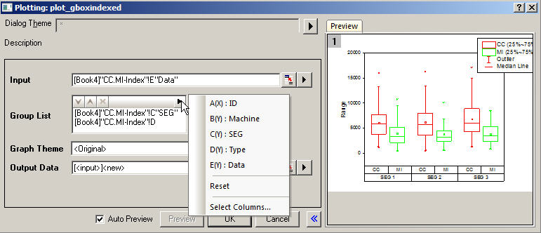
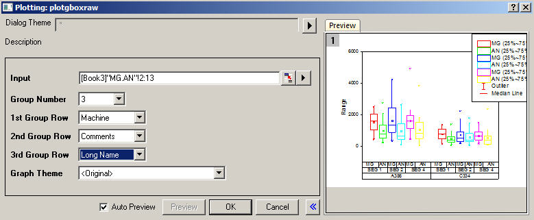
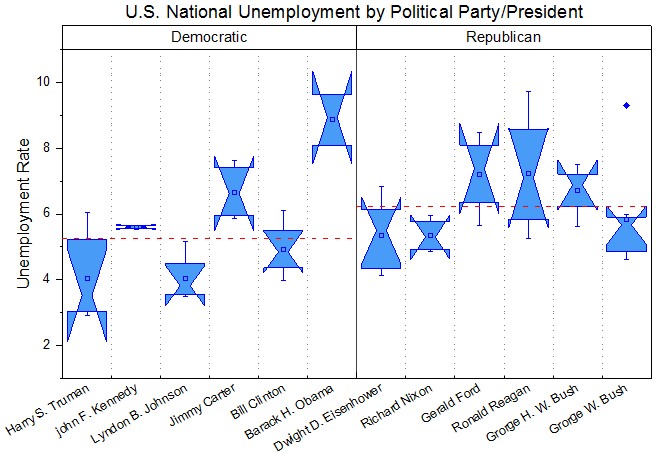
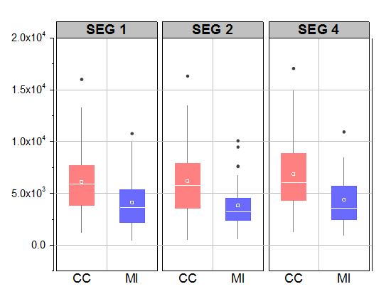
Origin supports plotting grouped Box chart from both Indexed Data or Raw Data.

Menus are available under Plot: Statistics menu. Buttons are available from 2D Graphs toolbar.

Image RemovedImage Added

Image RemovedImage AddedImage RemovedImage Added

How to:

  • Indexed Data: 
    Add group info column to Group List. This will break the origin column into subcolumns and plot each one as a box.
  • Raw Data: 
    Select the number of group level in Group Number dropdown list, specify the label rows for each group level. Each column will be plotted as a box.

Note:

Grouped-Plot-Only Style Controls


Image RemovedImage Added


Image RemovedImage Added

Image RemovedImage Added

How to:

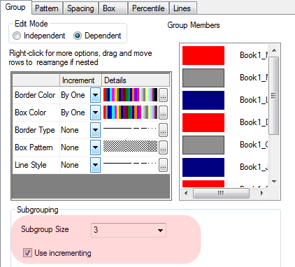
  • Increment Settings within Subgroups: 
    Go to Plot Details: Plot Properties: Box tab, check Use incrementing check box.
  • Separated Spacing Control Between or Within Subgroups: 
    Go to Plot Details: Plot Properties: Spacing tab.

Box Position with Information from Column Label Rows

  (ORG-4094) (ORG-8275)

Image RemovedImage AddedImage RemovedImage Added

How to:

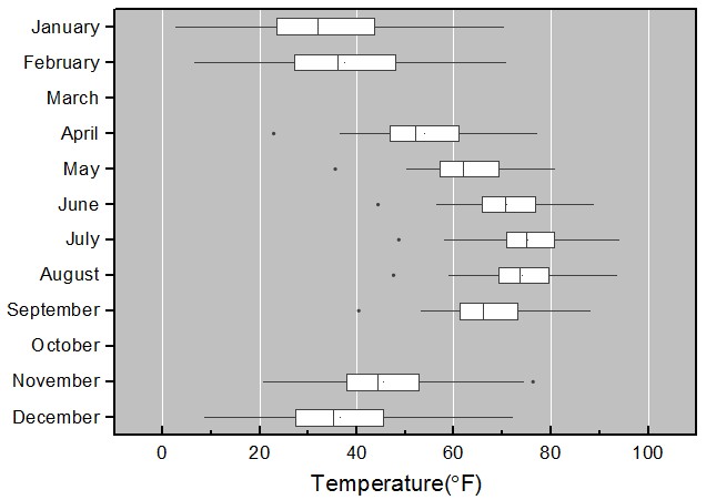
  • Position boxes by a column label row: 
    Go to Plot Details: Plot Properties: Box tab, choose label name in  X Position dropdown.
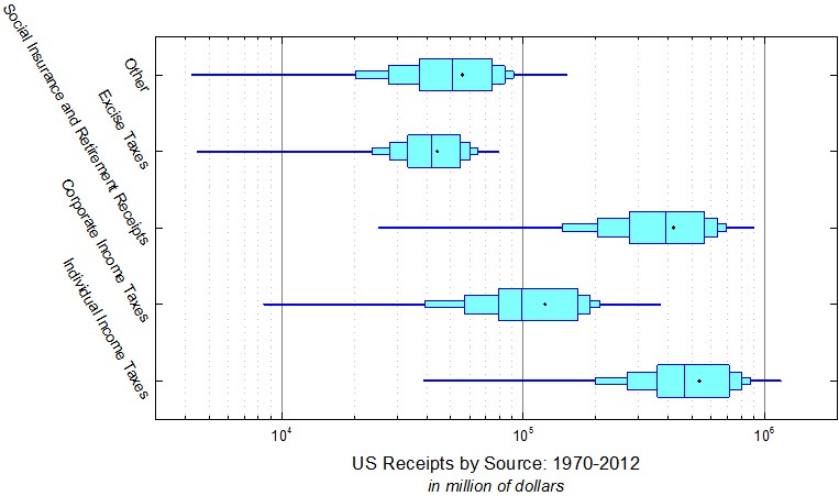
  • Horizontal Graph: 
    Click Graph: Exange X-Y Axes menu.

...
  (ORG-1943, ORG-981, ORG-5901, ORG-5881ORG-1905)


Image RemovedImage Added

Image RemovedImage Added

Image RemovedImage Added

How to:

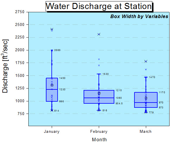
  • Specify boxes width by a column label row: 
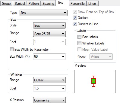
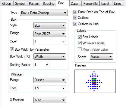
    Go to Plot Details: Plot Properties: Box tab, select Box Width by Parameter check box, choose label row 
    name in  Box Width(%) dropdown list..
  • Label box and whisker with data value:
    Go to Plot Details: Plot Properties: Box tab, check Box Labels check box and Whisker Labels. choose Values 
    from the Show dropdown list
  • Draw data on top of boxes: 
    Go to Plot Details: Plot Properties: Box tab, check Draw Data on Top of Box checkbox.
  • Set Data display width:
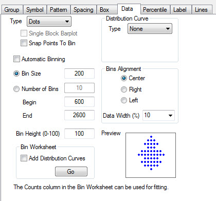
    Go to Plot Details: Plot Properties: Data tab, input Bins Alignment: Data Width(%). If set it to 0, 
    for example, data points will be in a line.
  • Indexing or mapping for data symbol color: 
    Go to Plot Details: Plot Properties: Symbol tab. Set Symbol Color dropdown list to be Indexing/Color Mapping
    and specify a column to be the reference.

...

  (ORG-7839 , ORG-9426 , ORG-8656)

Image RemovedImage AddedImage RemovedImage Added

Image RemovedImage Added

How to:

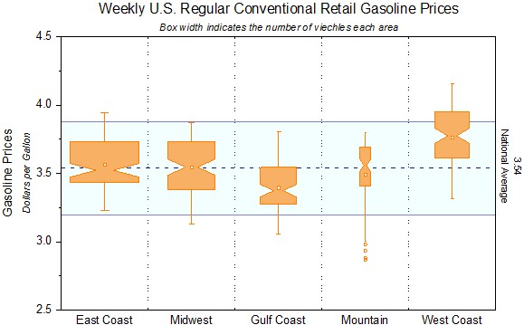
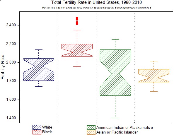
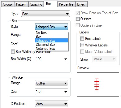
Go to Plot Details: Plot Properties: Box tab, set Box: Style to be I-shaped/Notched Box.

You can also change the parameters to custom your own box style.

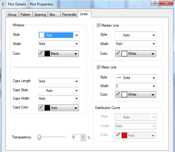
Individual Controls for Whiskers Caps Median Mean and Distribution curve

(ORG-816)

Image RemovedImage AddedImage RemovedImage Added

How to:

Go to Plot Details: Plot Properties: Lines tab.

Outliers in Line

(ORG-4305)

Image RemovedImage AddedImage RemovedImage Added

How to:

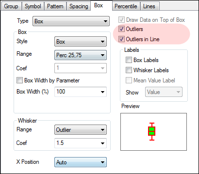
  1. Go to Plot Details: Plot Properties: Box tab
    You need to set Type to be Box or Box+Data to show outliers.
  2. Check Outliers checkbox.
  3. Check Outliers in Line checkbox to line them up.

Box Chart Legend

(ORG-4346 , ORG-8960)

Image RemovedImage Added
Image RemovedImage AddedImage RemovedImage Added

How to:

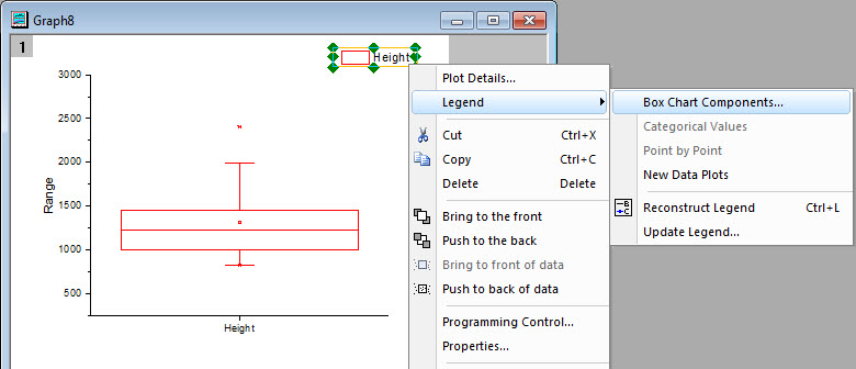
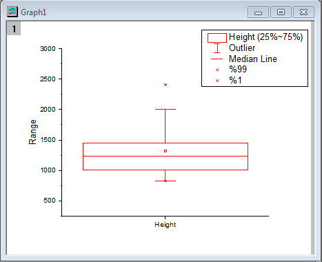
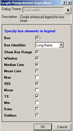
  1. Right click the origin legend in the graph and choose Legend:Box Chart Components....
  2. In Legendbox dialog, select the elements you want to show in the new legend.

Built-in Box Chart Themes

(ORG-7916)

Image RemovedImage Added

How to:

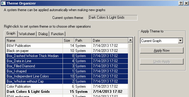
With Box chart graph window active, open Tools:Theme Organizer.

We provide some common box chart themes. User can apply it to quickly change box chart.

...

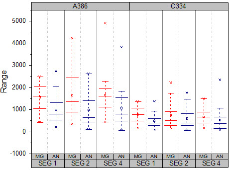
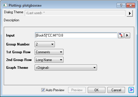
  1. Active Book5 in "1. Grouped Box Plot and Axis Ticks Table" folder, highlight column E through column J,
    select "Plot: Statistics: Grouped Box Charts - Raw Data" from Origin menu
  2. In the opened dialog, apply the settings as image below and click OK button to create a graph
    Image Removed
    Image Added

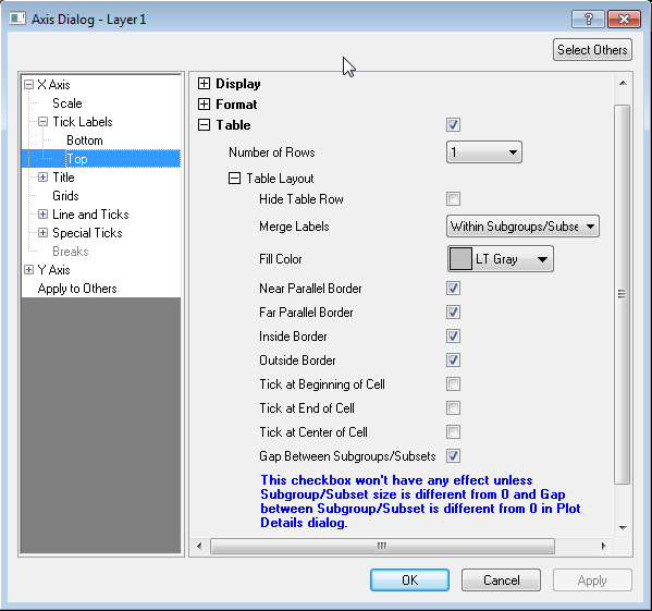
How to Customize the Table-liked Tick Labels

Image RemovedImage AddedImage RemovedImage Added

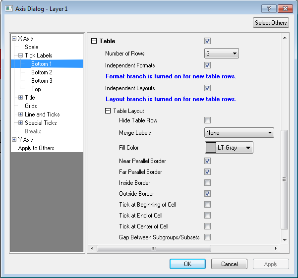
How to:

  1. Table-liked Tick Labels
    Select Table check box
  2. Define Rows in Table
    Expand the Table tree node and select in the Number of Rows drop-down list, Bottom N node will be shown in the 
    left panel. You can select and specify the settings in the Bottom N page (right panel)
  3. Different Style of Each Row
    Select Independent Layouts check box, specify the style in the Table Layout branch of each Bottom N page.
    Each row can be hided individually if selected Hide Table Row
  4. Different Font Color and Style in Each Row
    Expand the Table tree node and select Table: Independent Formats check box and specify the format in the 
    Format branch of each Bottom N page
  5. Set Background Color of the Row
    Expand the Table tree node and select from the Fill Color colorlist.
  6. Set Border of the Row
    Expand the Table Layout tree node under the Table branch, select or clear the Near Parallel Border,
    Far Parallel Border, Inside Border and Outside Border check box
    Image RemovedImage Added

Image RemovedImage AddedImage RemovedImage Added

How to:

  1. Merged Cells
    Expand the Table tree node and select Merge Labels check box. Please note that only  adjacent cells containing 
    the same text will be merged
  2. Gap Between Subgroups
    Expand the Table Layout tree node under the Table branch, Select Gap Between Subgroups/Subsets check box. 
    Go to Grids node in left panel, turn on Major Grid Lines: Show check box.
    Note: The options only works for grouped plots. The spacing between subsets are controlled in the Plot Details dialog
    Image RemovedImage Added

How to customize to make Graph1

How to customize to make Graph2

Image RemovedImage Added

How to:

Graph2 illustrate 3 improvements of the Box Chart in 9.1

  1. Grouped box chart from Raw Data
  2. Separated control of Whisker and Cap
  3. Outliers aligned in a line
  4. Table-liked Tick Labels

How to customize to make Graph3

Image RemovedImage Added

How to:

Graph3 illustrate 4 improvements of the Box Chart in 9.1

  1. Grouped box chart from Raw Data
  2. I-Shape Box
  3. Separated control of Whisker
  4. Table-liked Tick Labels

How to customize to make Graph4

Image RemovedImage Added

How to:

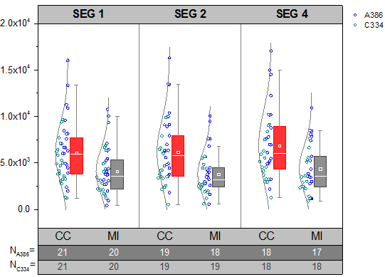
Graph4 illustrate 3 improvements of the Box Chart in 9.1

  1. Grouped box chart from Raw Data
  2. Show median and mean line and support separated style
  3. Table-liked Tick Labels

How to customize to make Graph5

Image RemovedImage Added

How to:

Graph5 illustrate 2 improvements of the Box Chart in 9.1

  1. Position boxes by a column label row
  2.  Horizontal Graph

How to customize to make Graph6

Image RemovedImage Added

How to:

Graph6 illustrate 3 improvements of the Box Chart in 9.1

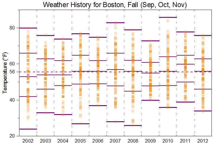
  1. Box width defined by a column label row
  2. Draw data on top of boxes
  3. Label the box and whiskers with data value

...